Analytics: Overview
Overview
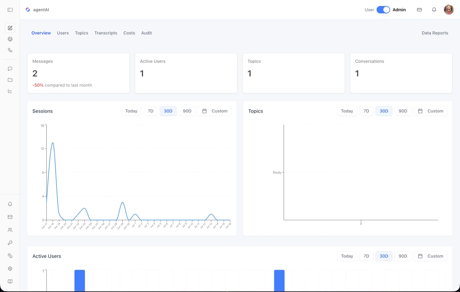
The Analytics Overview is the landing dashboard for an agent's analytics. It summarizes engagement at a glance — total messages, active users, conversation topics, and conversations — and charts sessions, topic activity, and daily active users over a selectable time window.
Analytics is scoped to a single agent. Every count and chart on this screen reflects activity for the agent named in the top-left of the header (for example, "agentAI"), not the whole organization.
To reach it, open the agent in OS, switch the header toggle from User to Admin, and select the analytics icon (the line chart) in the left sidebar. The Overview tab is the first of the analytics tabs: Overview · Users · Topics · Transcripts · Costs · Audit, with a Data Reports link aligned to the right of the tab bar.
Target Audience
Administrator
What You See
Messages card
The total number of messages exchanged with the agent. When there is prior-period data, the card also shows a percentage change "compared to last month" — green for growth, red for decline (the screenshot shows "-50% compared to last month").
Active Users card
The number of distinct users who have been active with this agent in the period.
Topics card
The number of conversation topics the platform has identified for this agent. Topics are labels automatically derived from what users discuss (for example, "Study").
Conversations card
The total number of conversations (chat sessions) held with the agent.
Sessions chart
A line chart plotting the number of sessions per day across the selected date range. Hovering a point reveals the exact value for that day; dates run along the x-axis and the session count along the y-axis.
Topics chart
A horizontal bar chart of message volume per topic. Each identified topic (such as "Study") appears on the vertical axis, with the number of messages attributed to it as the bar length.
Active Users chart
A bar chart of active users per day. Each bar is the count of distinct users who interacted with the agent on that date, so spikes show exactly which days drew usage.
Date-range controls
Every chart card carries its own filter row: Today, 7D, 30D (the default), 90D, and Custom, which opens a calendar for an arbitrary start and end date. Each chart can be filtered independently of the others.
Data Reports link
The right side of the tab bar links to the Data Reports screen, where the underlying data (chat history, user reports, and more) can be exported as CSV files.
How to Use
Step 1: Open the Overview
In the agent workspace, switch the header toggle to Admin and click the analytics icon in the left sidebar. The Overview tab loads by default.
Step 2: Read the headline cards
Check Messages, Active Users, Topics, and Conversations for the current totals. Use the "compared to last month" percentage to judge whether engagement is trending up or down.
Step 3: Adjust the time window
Click Today, 7D, 30D, or 90D on any chart, or click Custom to pick exact dates from the calendar. Each chart filters independently, so you can compare a 7-day session view against a 90-day active-user view.
Step 4: Drill into the details
Use the other tabs for depth: Users for per-user activity, Topics for subject-matter analysis, Transcripts to read conversations, Costs for spend, and Audit for configuration changes. Click Data Reports to export raw data as CSV.